LayerLens | advised by Adobe
Redefining Navigation in Complex Layer Structures
Empowered efficiency and collaboration for 10M+ creatives by mapping their natural understanding of dimensional hierarchies through visual representations.
Project Type
Capstone Project
Timeline
Feb 2025 - Aug 2025
Team
Linda Xiao
Ariel Huang
Xinyi Zhao
Principal Designer @ Adobe (Advisor)
Tools
Figma
After Effects
Final Cut Pro
Problem & Challenge
Navigating complex layer structures in design work drains cognitive energy, disrupts collaboration, and slows creative workflow. This universal friction is caused by a misalignment between the linear layer panel and the graphical, dimensional main canvas, and diverse mental models and working habits of creative professionals.
Solution
LayerLens transforms how designers navigate complex 2D compositions through visual-first layer representations. It organizes occluded elements into depth levels and provides visual cues for deeply nested relationships, delivering contextual clarity that streamlines creative flow.
What I did
Led the design of 3 features (2.5D view, layer panel, and navigation).
Conducted user research and usability testing, gathering insights from 20+ participants to inform design decisions.
Produced impactful videos using storytelling and motion graphics to communicate design rationales.
Impact
Streamlined Workflow: Reduced the cognitive load and time creatives spend on deciphering complex layer hierarchies.
Improved Efficiency: Enabled faster task completion involving common layer operations.
Eliminated Friction: Avoid layout breakage for layer navigation or edits.
Boosted User Confidence: Reduced anxiety when working on complex compositions.
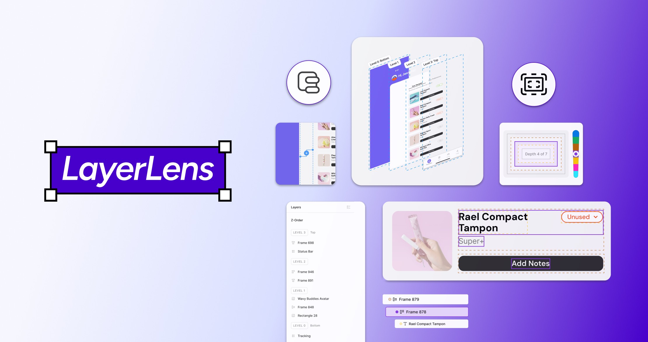
FINAL DESIGN
LayerLens is a visualization tool that clarifies complex occluded and nested layer hierarchies. It combines Z-Order and Visual Coding.
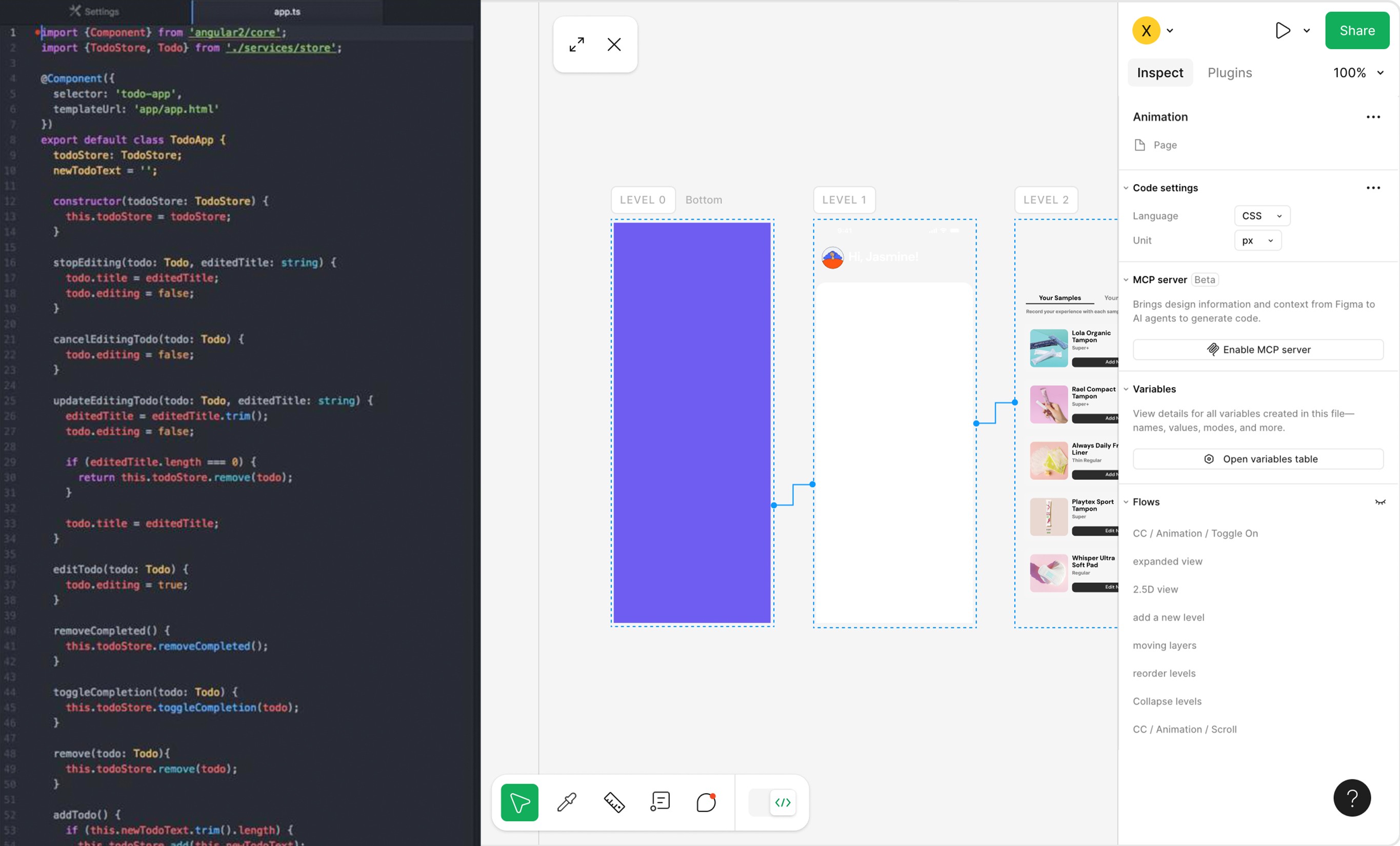
Z-Order: Expanded View for precise manipulation
Z-Order organizes occluded elements into depth levels. The Expanded View enables precise editing through adding, rearranging, and merging levels, while retaining all native Figma editing features.
Z-Order: 2.5D View for instant clarity of occluded structures
The 2.5D View provides spatial context, allowing designers to understand layout structure instantly with less reliance on the layer panel. Also, selecting a level directly from the 2.5D View streamlines layer selection and manipulation.
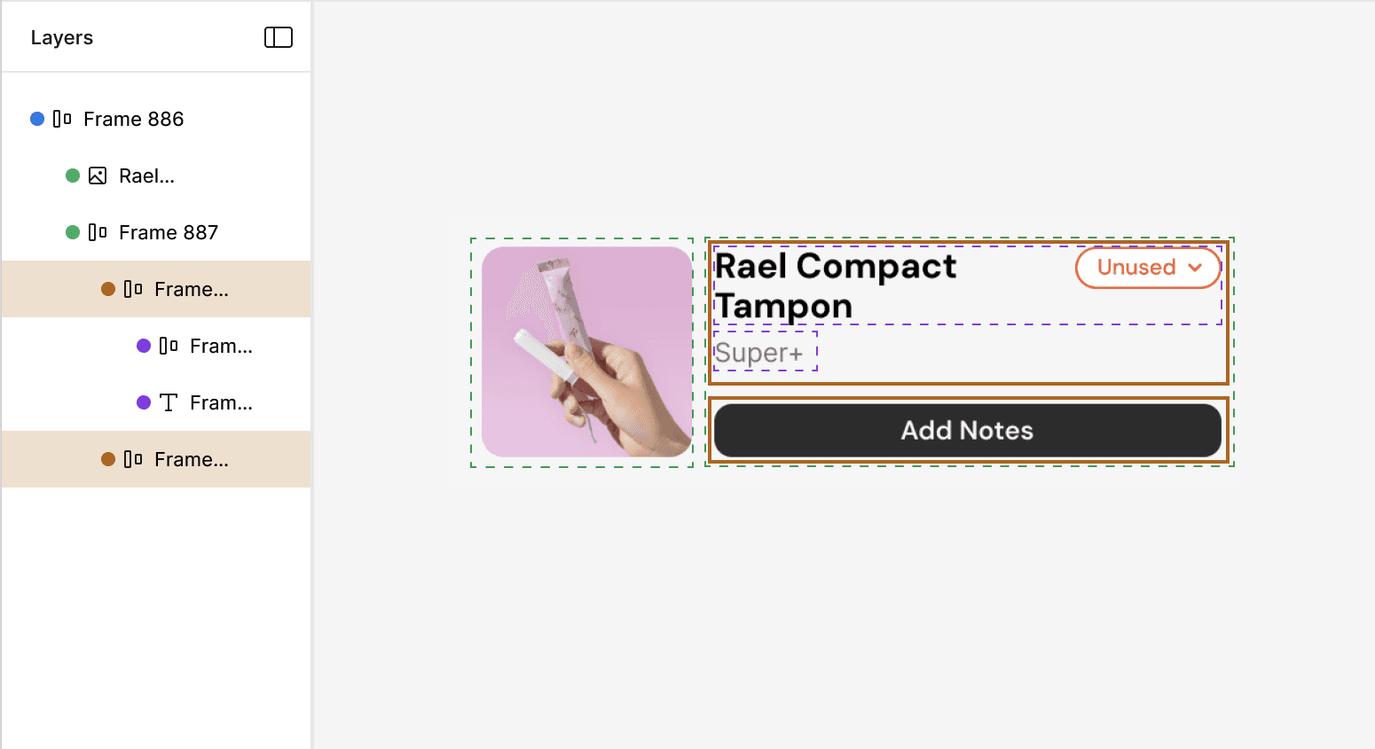
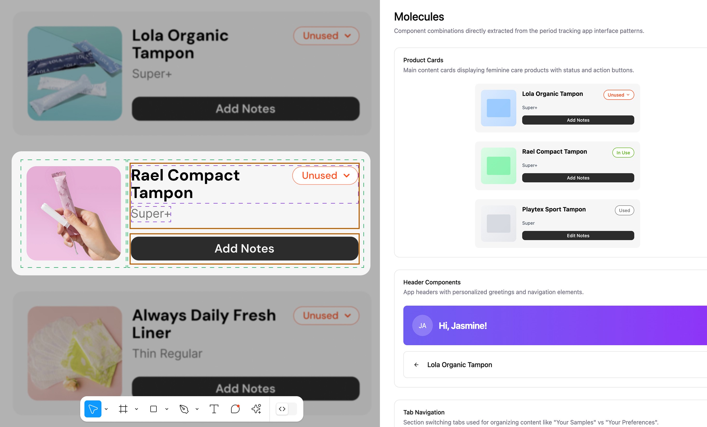
Visual Coding: Understand deeply nested structures at a glance
Solid lines mark the in-focus depth level, and dashed lines indicate its parent-child relationships, making contextual hierarchies clear at a glance. All native Figma editing features remain, enabling efficient task completion while learning layer hierarchies.
Watch the video I made to get a glimpse of the project!
RESEARCH
Creative tools evolve, but layer management remains broken.
Desk research: Layer navigation is a universal challenge
It spans 2D and 3D design, video editing, web builders, and even presentation slides. It diverts users’ attention, interrupts creative flow, and slows task completion.
What makes a composition “complex”?
Number of layers
Level of nesting
Degree of occlusion
Converge now, diverge later – Why Figma?
Due to time constraints, we focus on Figma as a carrier of the design concept, enabling thorough research and high-quality design outcomes, while envisioning its applicability across other layer-based tools.

User research
To understand designers' and collaborators’ processes and pain points of navigating layers in complex compositions, we conducted 9 contextual inquiry sessions.
7 designers, 1 engineer, and 1 product manager
60-min each
Observation + follow-up interview
Key Insight 1
The flat layer panel fails to reflect dimensional structures, mismatching with designers’ mental models.
The layer panel serves as a “source of truth” for complex structures, but its limited space, long names, and weak visual cues make scaled hierarchies hard to navigate.
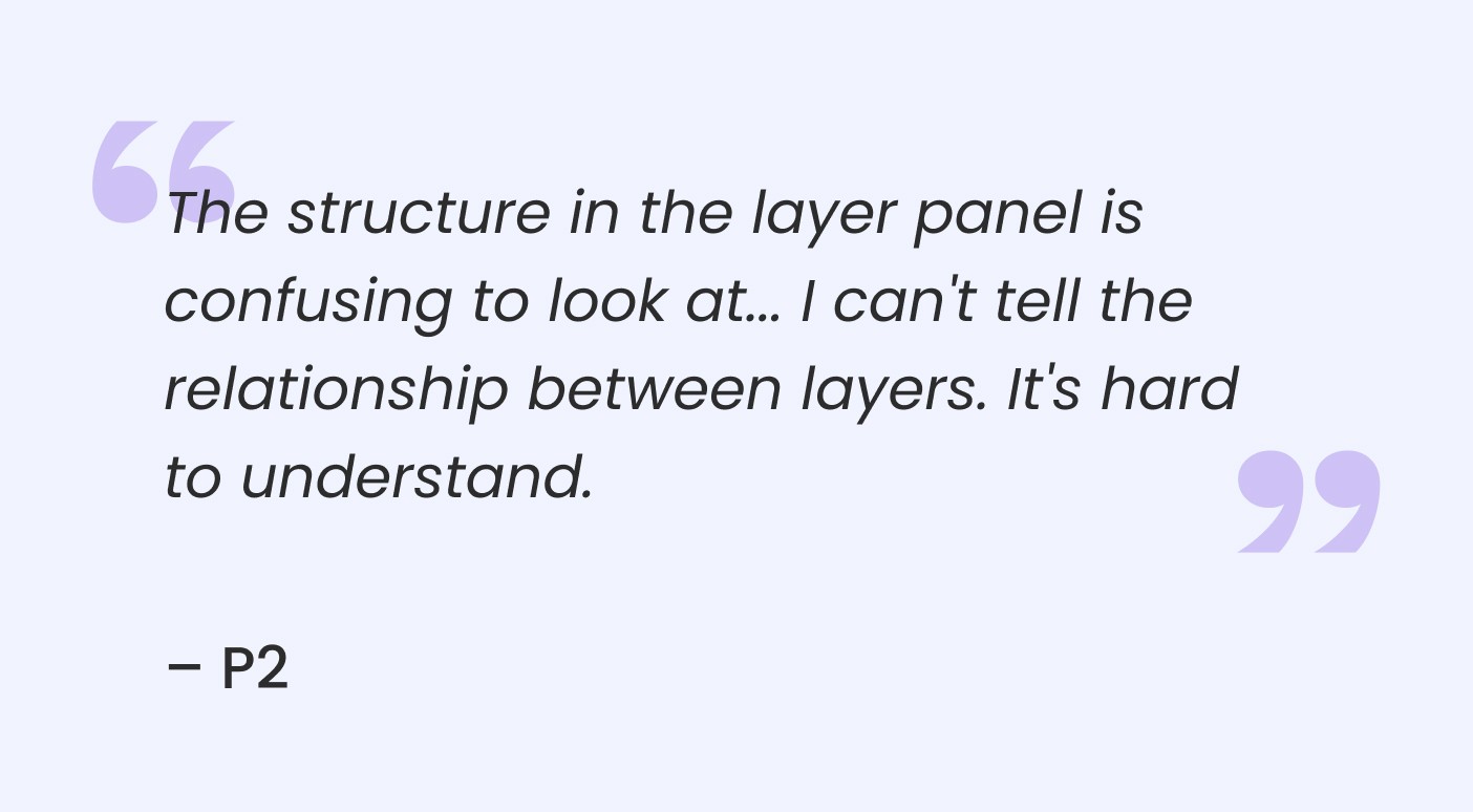
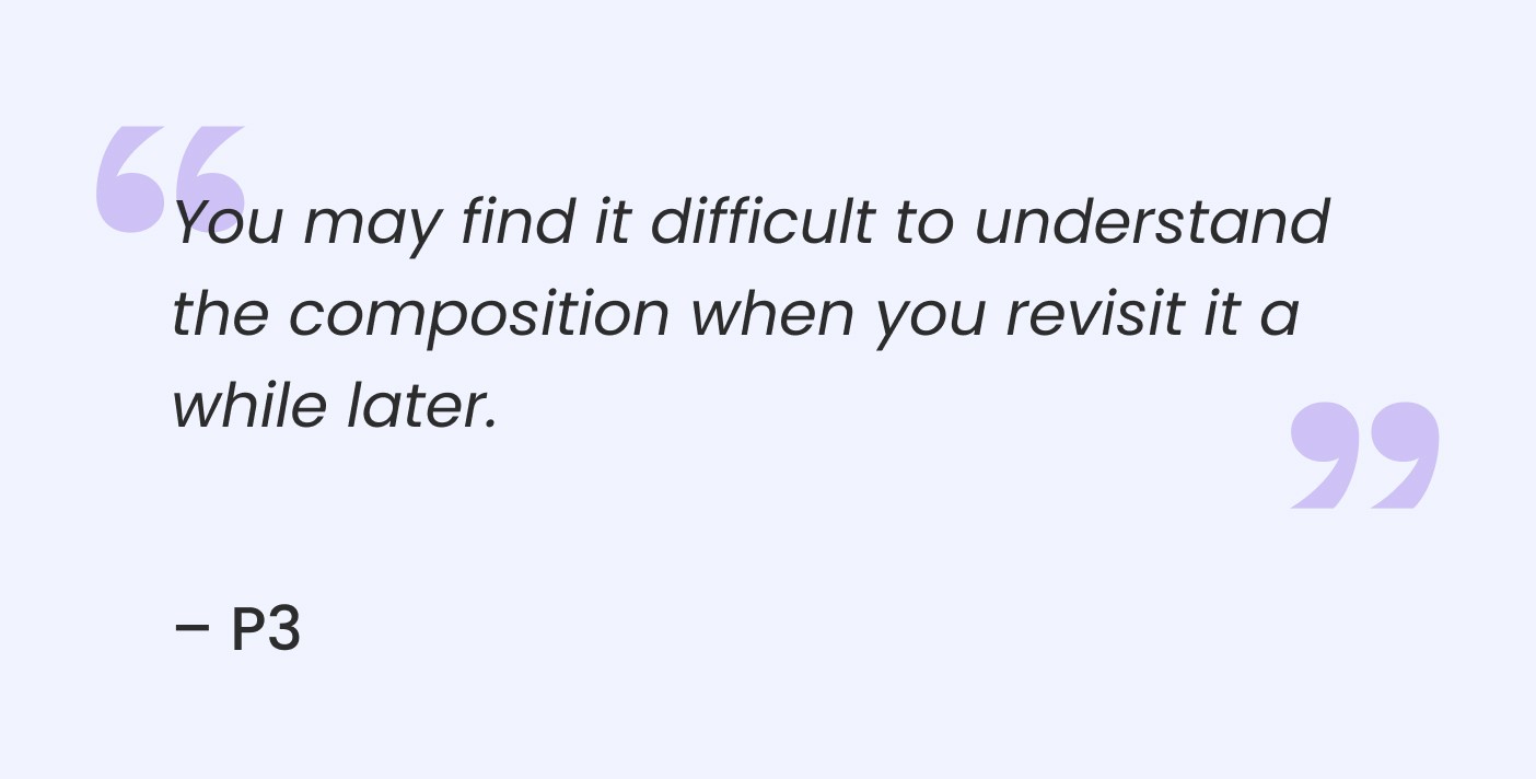
Key Insight 2
Layer structures are difficult to interpret after context switching.
Designers depend on working memories to build and navigate compositions, making it difficult and time-consuming to revisit later.
KEY PROBLEM
Mismatch between the layer panel and the canvas = constant context switching & dividing attention.
Complex 2D compositions expose a disconnect between the linear, list-based layer panel and the dimensional, visual canvas. Navigating heavily occluded and deeply nested structures forces constant context switching and dividing attention, creating cognitive load and disrupting creative flow.
IDEATION
Visual-first layer representations are key to bridging the gap.
Co-design workshops to pinpoint design opportunities
We conducted 2 co-design workshops with 7 designers and synthesized the insights to evaluate opportunities by priority and feasibility. Focusing on visual-first layer representations that align with designers’ mental models, we narrowed the space to two key themes.

Categories, summaries, and automation on the z-axis
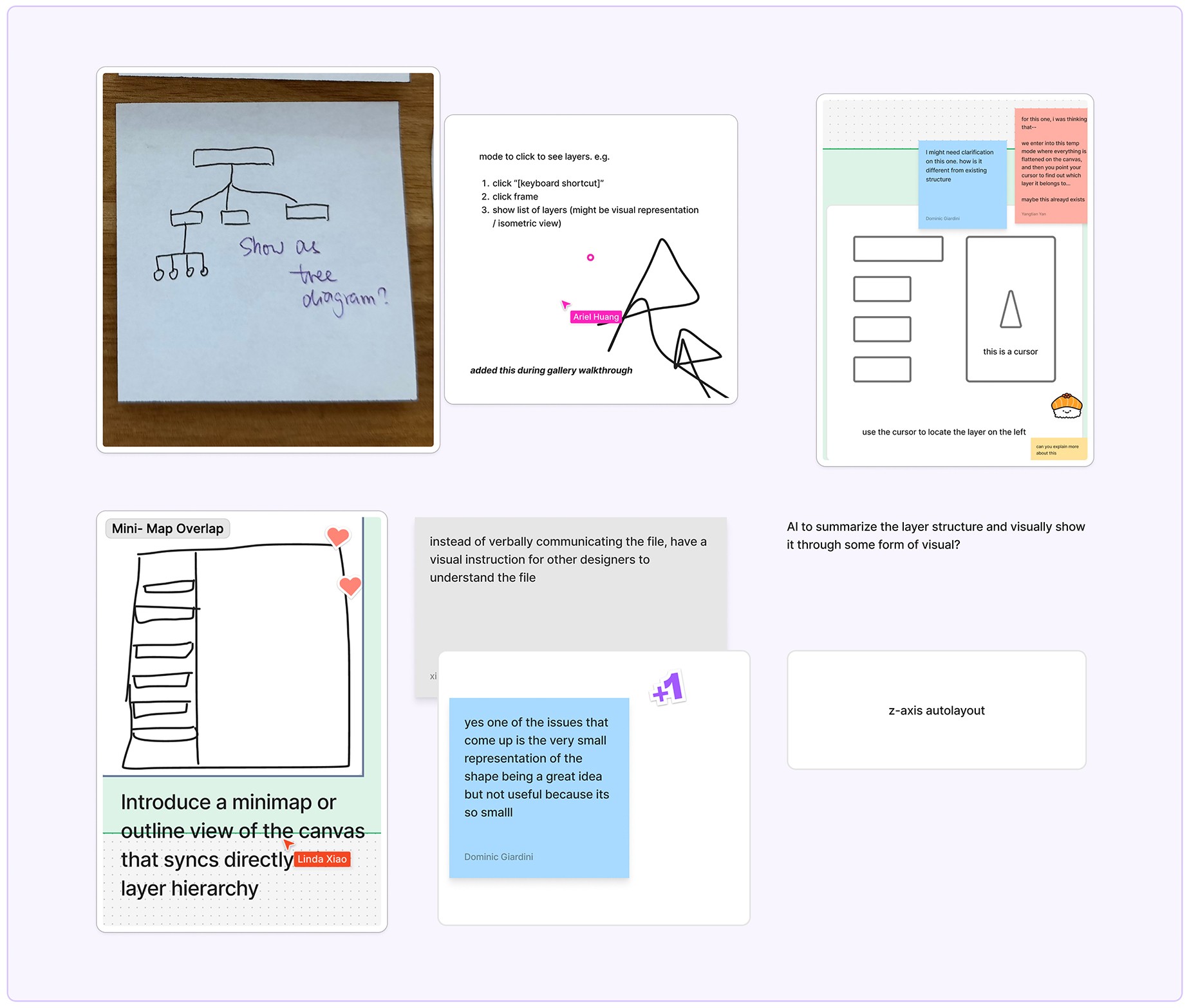
Additional views of compositions to support understanding
Analogies to generate tangible design solutions
I employed analogous research to turn the ambiguity in the design concept into clarity.
Idea 1 | Z-Order
CT/MRI scan → Cutting compositions into slices
"When you MRI anything, you acquire the image slice by slice,” said Andy Ellison, Chief MRI Technologist at Boston University. This idea became part of the Z-Order feature in LayerLens to “cut” dimensional layer compositions into slices.

Magnetic Resonance Imaging (MRI) of Foods – Papaya, by Andy Ellison
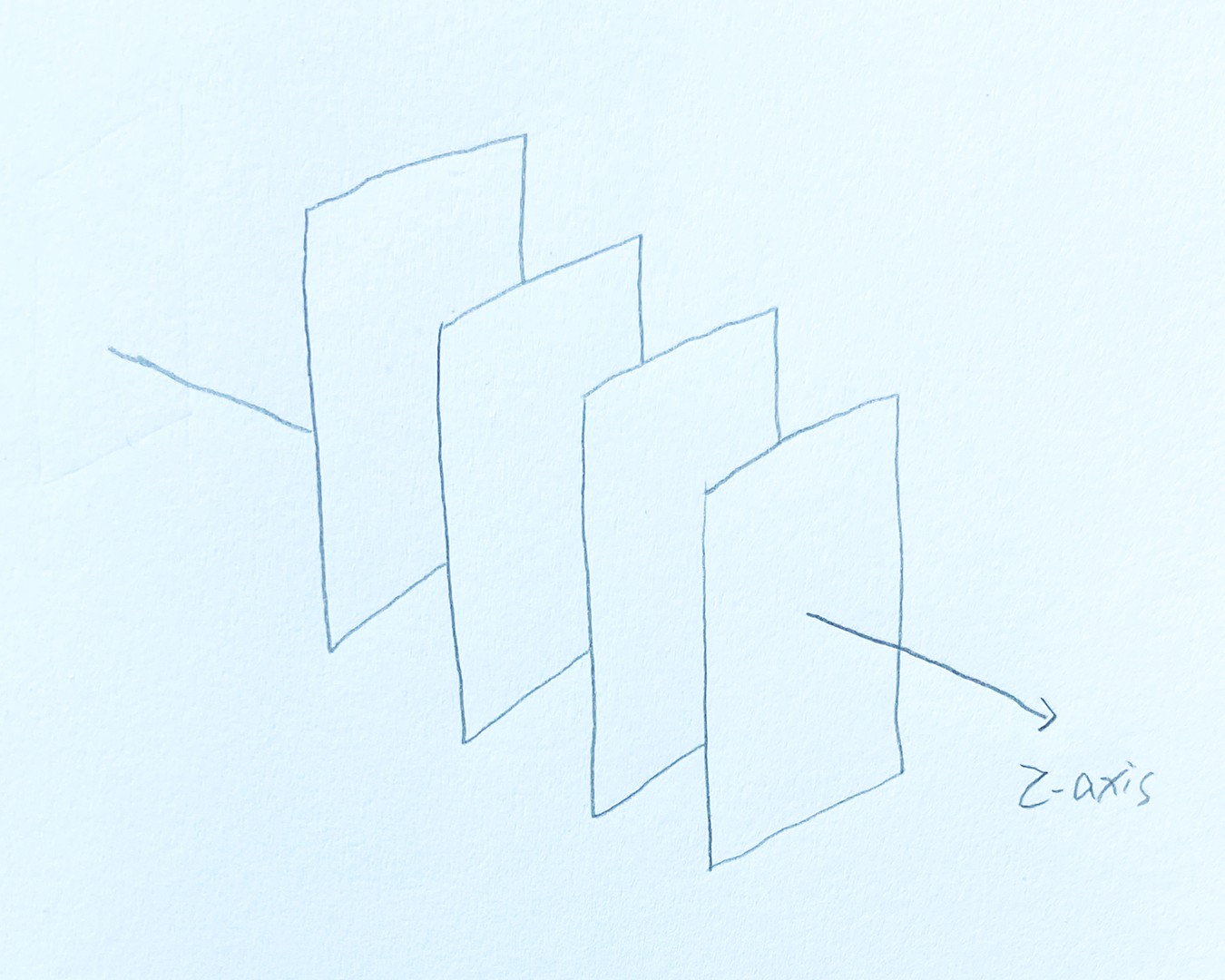
Initial Sketch of Z-Order
Idea 2 | Visual Coding
Pilots’ weather diagrams → Visual cues for dimensional conditions
As a former designer at an airline company, I was intrigued by how pilots visualize dimensional cloud conditions and found their weather diagrams on flights. The colors and lines in the diagrams inspired the Visual Coding concept in LayerLens.
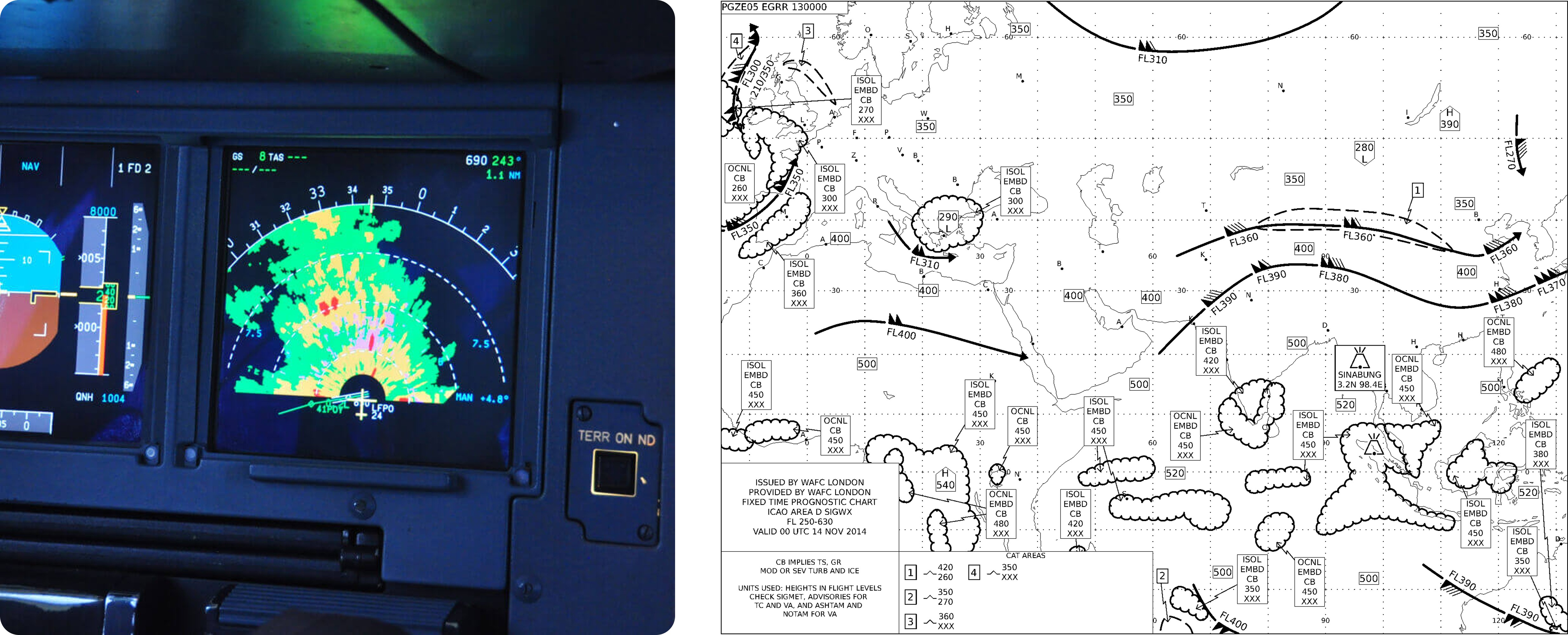
Weather Radar on Airbus & Significant Weather (SIGWX) Chart
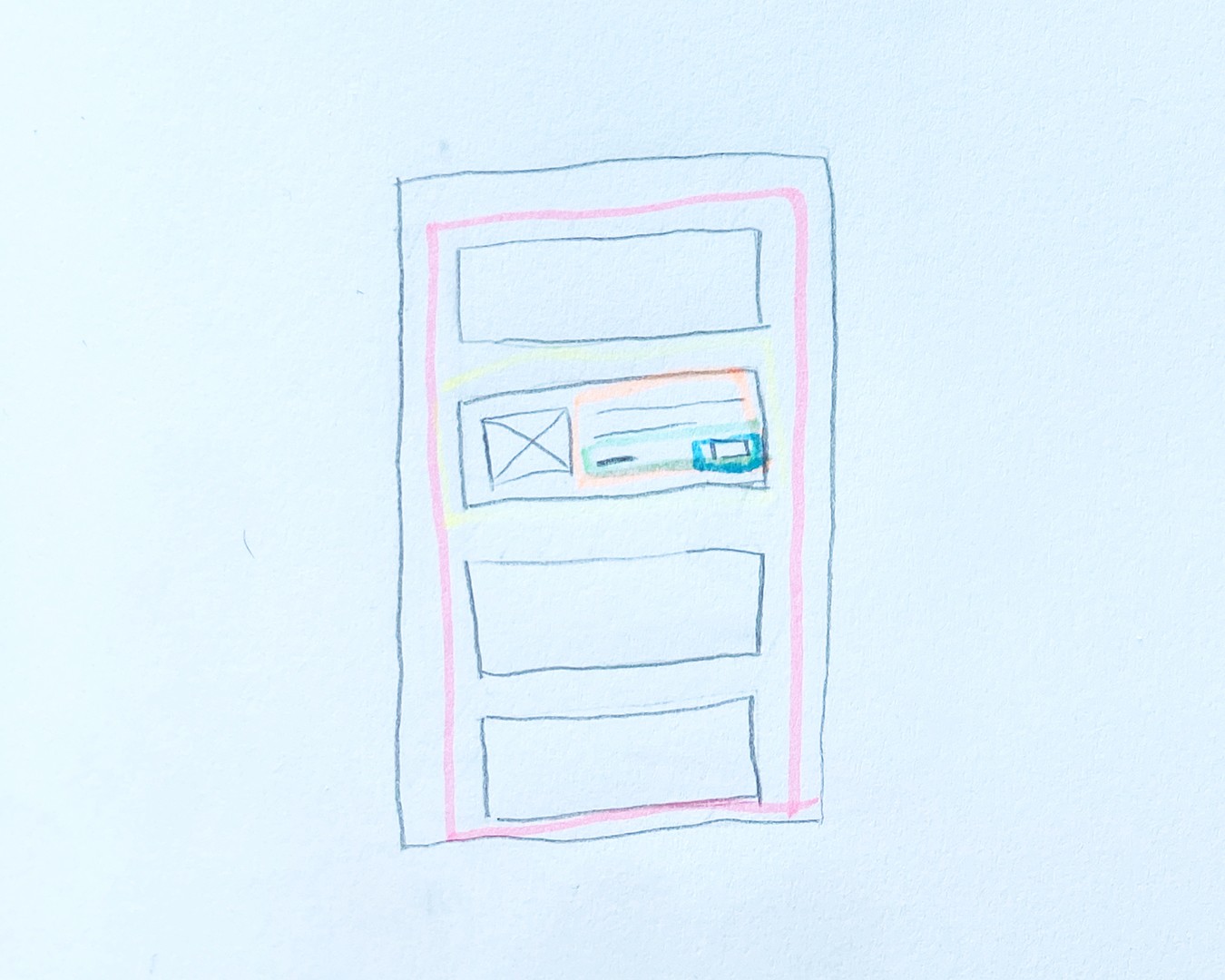
Initial Sketch of Visual Coding
OWNED FEATURE 1
2.5D View in Z-Order: Providing spatial context for instant clarity
After elements are assigned to different z-axis depth levels based on semantic importance, the 2.5D View provides a dimensional visual reference for spatial hierarchy.
In the initial design, I introduced a static 2.5D mini-map in the corner of the canvas to serve as a spatial visual reference for the editable Expanded View.
Before

We tested the mid-fidelity design with 3 designers through moderated interviews, presenting the interactive prototype and asking feedback, alongside external design critiques.
Although users found the 2.5D mini-map effective for visualizing the layer stack, they wanted direct interaction. So I evolve it into an interactive 2.5D View with spacing adjustments, hovering, and level selection, while keeping precise editing in the Expanded View.
Final Design
OWNED FEATURE 2
A contextual layer panel in Visual Coding
The original layer panel in Figma and many other creative tools displays all expanded layers when a nested object is selected, unless the user collapses the layers manually. This makes navigation in the layer panel difficult.
Before

Therefore, I designed a contextual layer panel for Visual Coding that displays only the layers in the selected frame, using colors as the visual cue to clarify hierarchy.
In usability testing, users still found it time-consuming to align the layer list with canvas navigation. Thus, I refined the design to show only the focused level and its parent and child levels, collapsing all other layers within the selected frame.
Initial Design
Final Design

OWNED FEATURE 3
Mini-map in Visual Coding: Intuitive and precise navigation control
Our initial design used a vertical scroll bar for navigation within a nested structure in Visual Coding.
In our internal design critique, I proposed a perspective scroll bar to better align users' mental model of scrolling within a dimensional nested structure rather than in a 2D space.
Before
Iteration
In usability testing, users found the perspective scroll bar better reflected the dimensional, nested hierarchy than the vertical scroll bar, but its unconventional interaction felt awkward and didn’t support cross-level navigation.
Thus, I refined the design into a mini-map that preserves intuitive, precise navigation while serving as a clear source of truth, indicating depth relationships of the visual cues on the canvas.
Final Design
MORE USE CASES
LayerLens is also a lifesaver beyond creating UI designs.
An instant hierarchy breakdown for engineers at design-to-dev handoffs
A nested structure scanner to help maintain design systems without breaking the original layout
An easier access to occluded and nested layers in graphic design
A shortcut for spatial design edits
OUTCOME
LayerLens: An ambitious project solving the layer mess designers struggle with.
"
This is a really ambitious project. You all were very ambitious about trying to help multiple people understand a complex composition. That's a hard thing.
– Daniel Robbins, Principal Designer @ Adobe
"
"
Love to see research and thinking into this area. Doubly so when you’re thinking of ways to improve Figma. Great work you all!
– Jacob Miller, Principal PM @ Figma
"
"
LayerLens is really awesome and cool! It solves designers’ long-standing pain points in layer management and understanding. I could totally see myself using it!
– Classmate feedback in design critique
"
NEXT STEPS
Moving forward…
I plan to build a functioning LayerLens prototype, either using vibe coding or converting it into a real Figma plug-in. This could also enable data-driven testing and measure real impact. Target metrics include:

Next Project
An eCommerce app for lifestyle products, resolved 100+ UX/UI issues within 6 weeks
