Cathay Shop
Reducing User Friction in a Localized eCommerce Platform
Resolved 100+ UX/UI issues in 6 weeks, enhancing usability and improving design consistency through design evaluation, rapid iteration, and scalable design. Achieved 6,000+ daily users in 2 months of launch.

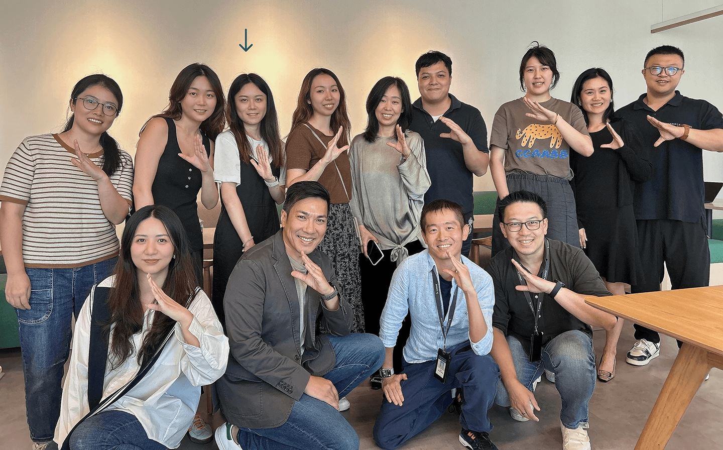
Team
Linda Xiao - Design
2 Product Managers
2 Business Managers
External Engineering Partners
Tools
Sketch
Problem & Challenge
As Cathay Pacific’s customer base in Mainland China grew, the brand faced a significant barrier to growth: a gap in localization. Cathay planned to build a localized eCommerce mini-app within a tight initial launch timeline.
Solution
After the initial development stage, I conducted Heuristic Evaluation and rapid design iteration for the Cathay Shop mini-app, making key usability and design consistency improvements. While following the global design system, I also built a style guide tailored to the mini-app.
What I did
Heuristic evaluation and rapid design iteration on interaction flows and UI.
Cross-functional collaboration with Product Managers, Business Managers, and Engineers.
Advocated for users while balancing business goals, ensuring pixel-perfect implementation under technical/time constraints.
Impact
100+ UX/UI issues identified and resolved within a tight 6-week pre-launch window.
6,000+ daily active users achieved within the first 2 months of launch.
Reduced user friction, enhanced usability, design consistency, and scalability.
FINAL DESIGN

CONTEXT & PROBLEM
A gap in localization, a barrier to growth in the 2nd largest market.

Cathay’s post-COVID pro-Mainland business strategy
Satisfy the high transfer demand from Mainland China through the Hong Kong Airport to the world.
Grow the Cathay membership network in Mainland China through Cathay Shop.
The localization gap in the Mainland China market
Unfamiliar payment methods and currency on the global Cathay Shop website.
Long wait and inconvenient return/exchange experience due to international shipping.
PRODUCT SOLUTION
Cathay Shop mini-app: Delivering a localized shopping experience with a loyalty program.
The Cathay Shop mini-app lives on WeChat, a daily-used social media by Mainland China users, offering an app-free browsing and shopping experience without requiring additional downloads.

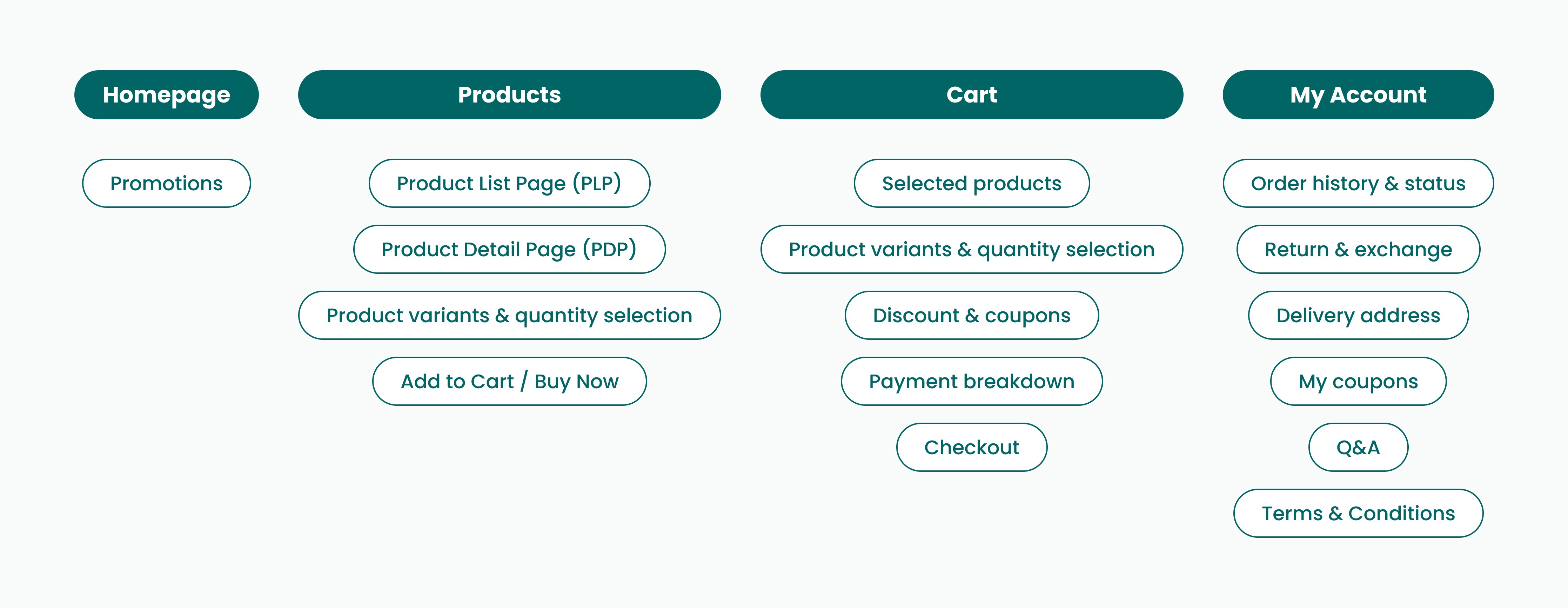
MY ROLE & APPROACH
Final design QA and rapid iteration before initial launch through heuristic evaluation.
When I joined the project, the team had finished the first development phase. My responsibility was to evaluate and refine the prototype’s usability and visual design before launch.
I collaborated closely with the Product Manager, Business Manager, and an external engineering team to refine the pre-launch prototype.
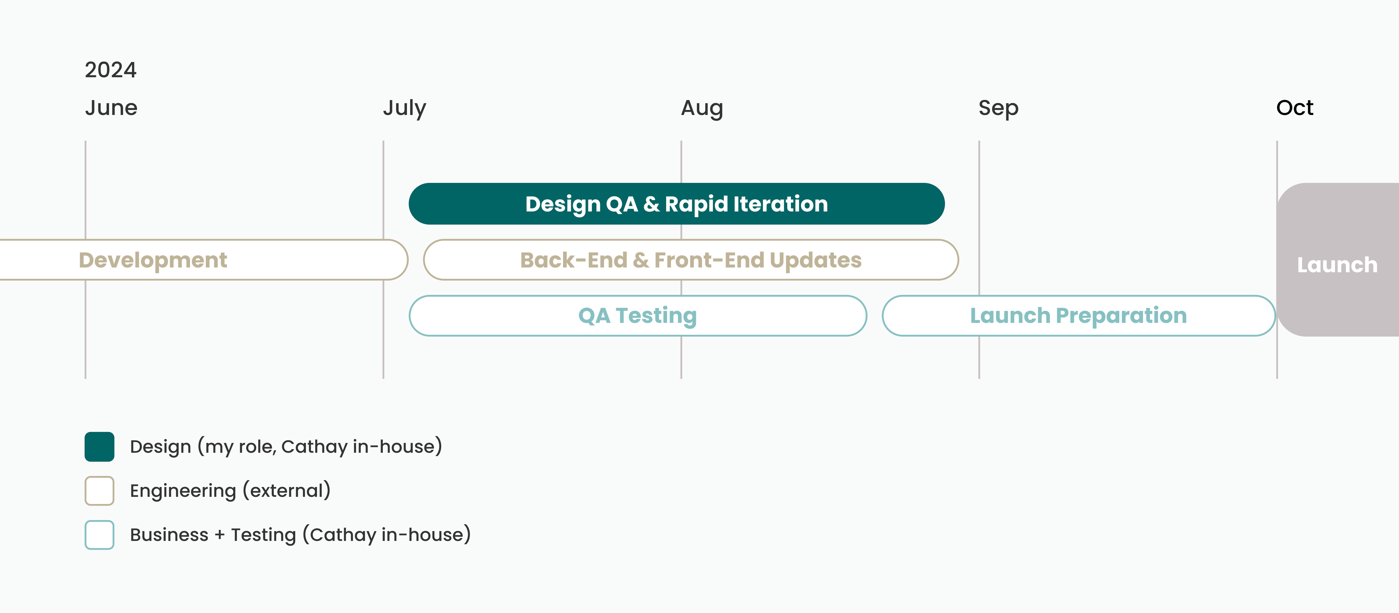
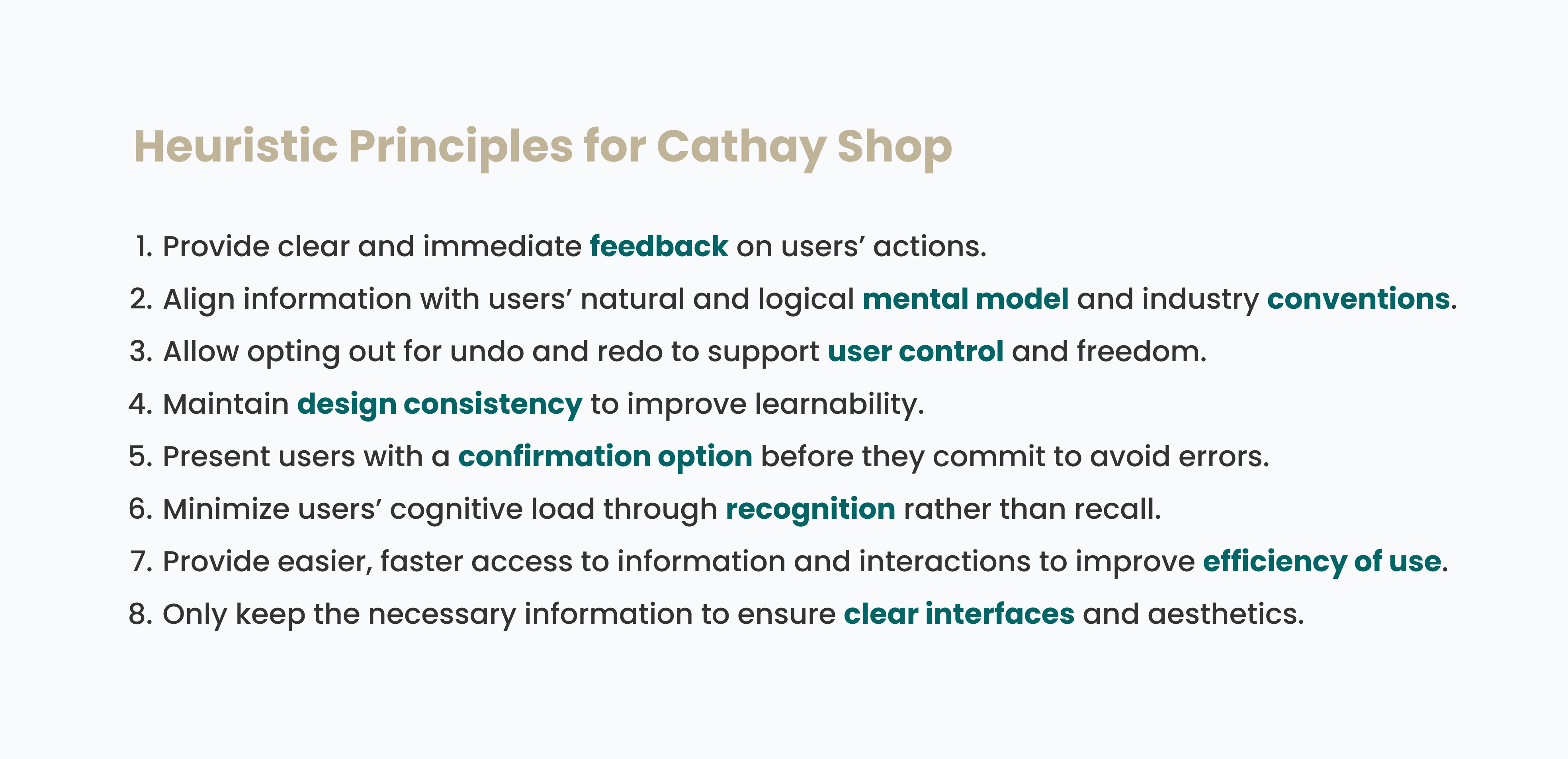
Heuristic evaluation: Fast, focused evaluation for a timely launch
Given the tight timeline and near-final product stage, I conducted a heuristic evaluation instead of longer research methods to quickly identify and fix key usability and visual issues.
I reviewed ~100 screens across core flows (product selection, checkout, order tracking, return/exchange, etc.), using Jakob Nielsen’s 10 Usability Heuristics to define guiding principles and refine the design.
Task prioritization
Under tight deadlines, I ranked 100+ identified UX/UI defects into three priority levels based on severity and feasibility when sharing with the cross-functional team.

Examples of the UX/UI defects spreadsheet
ITERATION EXAMPLE 1
Advocate for users while serving business needs
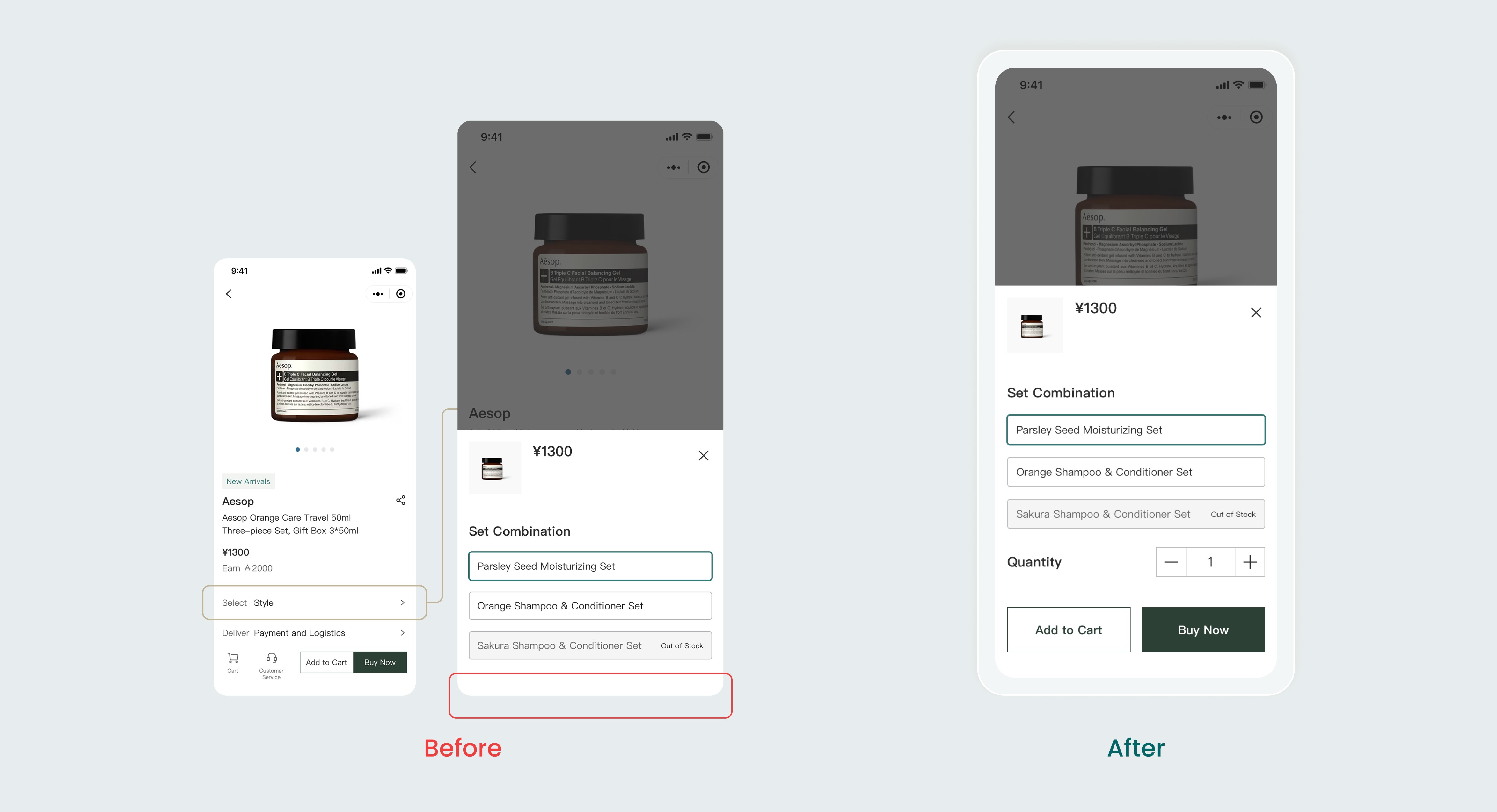
Problem:
Users had no confirmation or feedback after selecting a category, forcing them to manually exit to verify their choice and risking drop-offs. (Heuristics #1 & #5)
My Solution:
Added "Add to Cart" and "Check Out" buttons to provide immediate confirmation and a clear call-to-action, enhancing both usability and conversion.
ITERATION EXAMPLE 2
Design for user behavior while improving design consistency
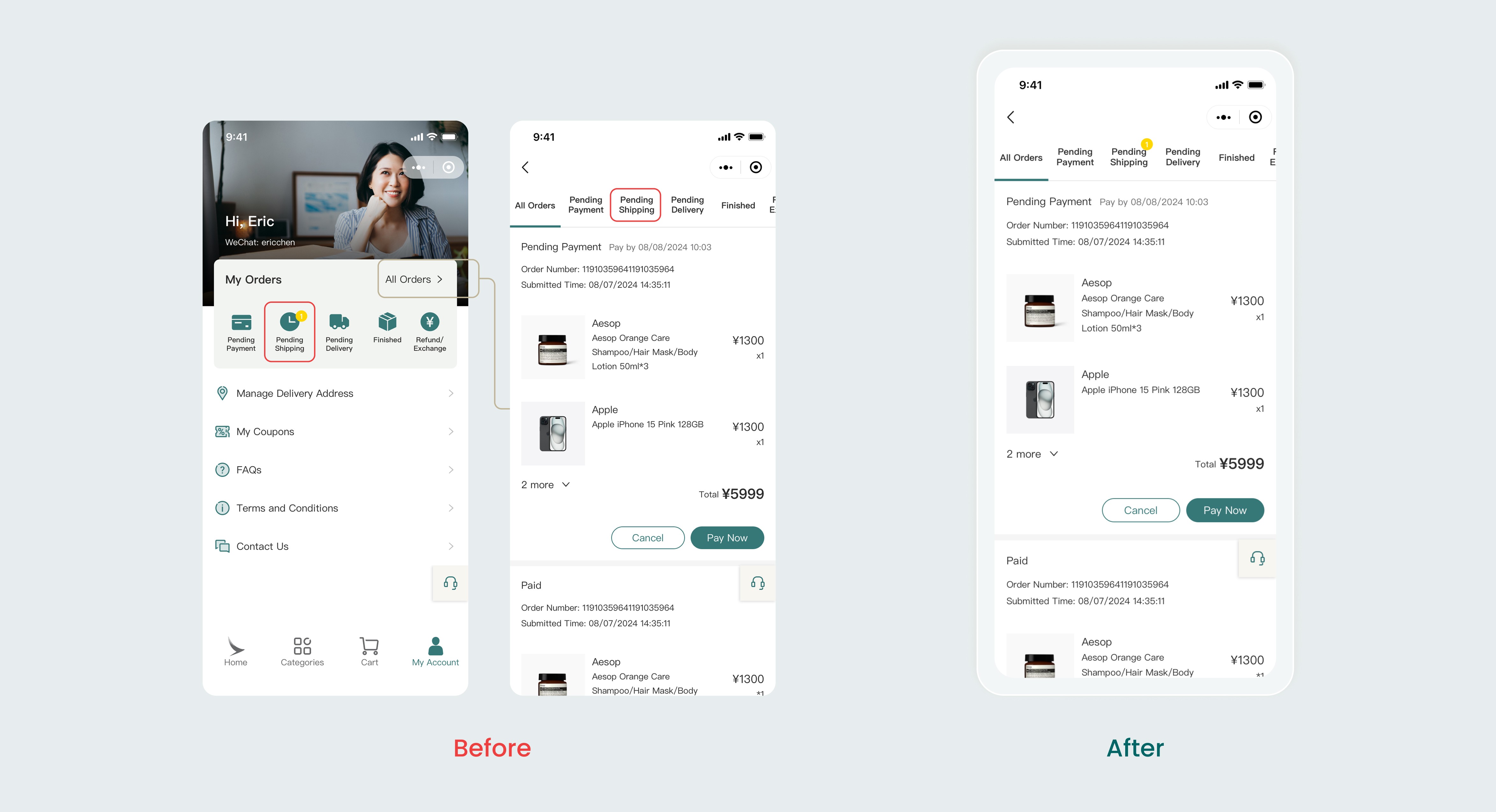
Problem:
Order counts were inconsistently displayed between preview and detail pages, increasing cognitive load for users checking updates. (Heuristics #4, #6 & #7)
My Solution:
Standardized order count visibility across all active order pages to improve learnability and reduce navigation effort.
ITERATION EXAMPLE 3
Aligning with visual conventions and user expectations
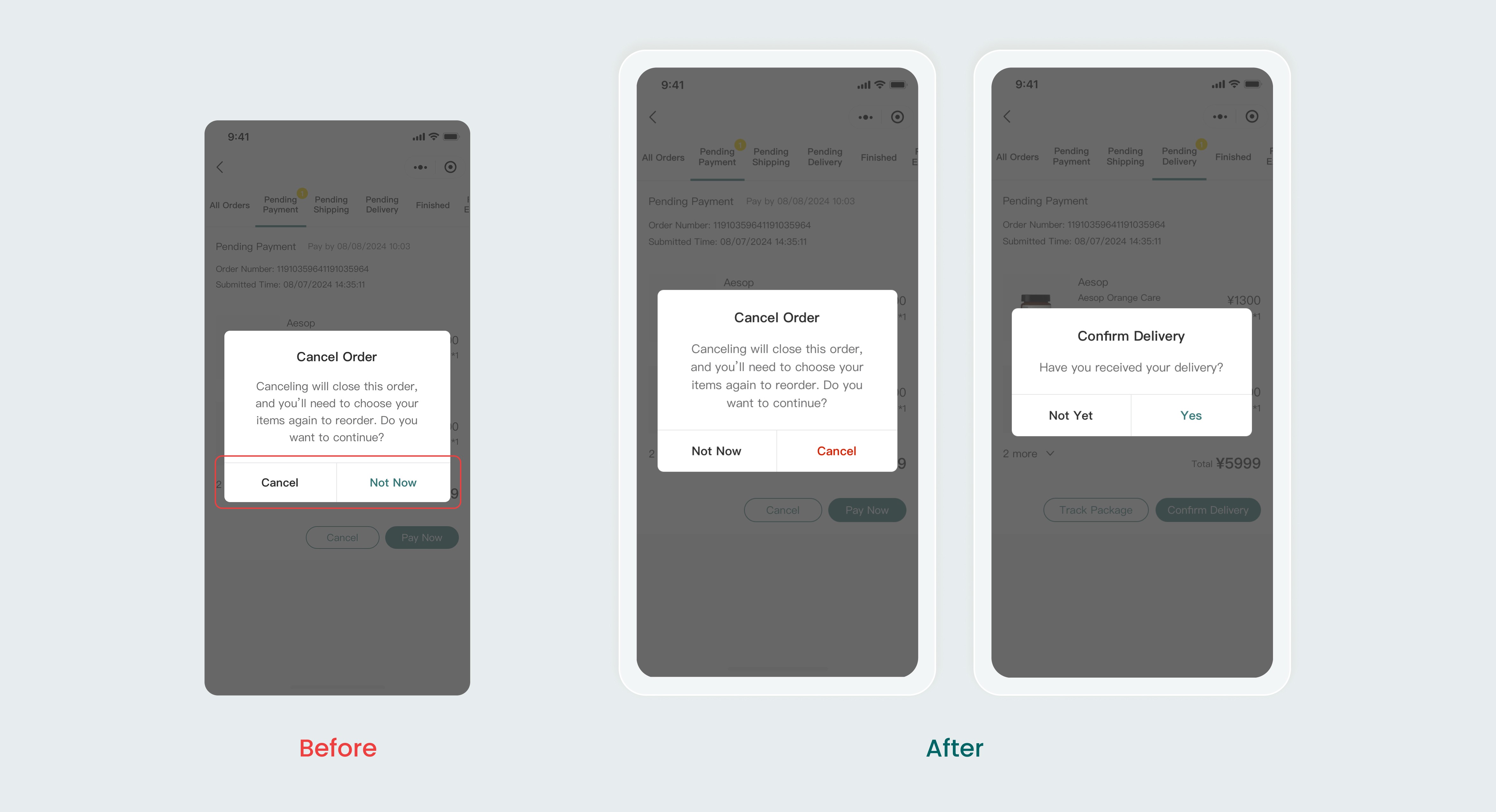
Problem:
The previous design failed to follow UI color conventions and Cathay brand guidelines (red for warnings/deletions and green for positive actions) and placed confirmation buttons on the left rather than the right. (Heuristic #2)
My Solution:
Applied semantic colors (red for destructive actions and green for positive confirmations) and repositioned the confirmation button to the right to align with conventional user mental models.
ITERATION EXAMPLE 4
Consider edge cases and tailor to customer needs
Problem:
The system forced users to return entire groups of identical products rather than individual items, creating unnecessary friction. (Heuristic #7)
My Solution:
Introduced quantity selection for returns and exchanges, allowing for precise, real-world handling of multi-item orders.

STYLE GUIDE
Ensuring design scalability and consistency
To extend the design system for localization while leveraging Cathay’s existing assets, I created a specialized style guide for the Cathay Shop mini-app. This document provides visual and interaction specifications for the design, product, engineering, and business teams, ensuring visual design consistency and scalability.


OUTCOME
Quick usability & design improvement within a tight launch schedule


"
Great job finding solutions by thinking from the users' perspectives. I also appreciate your initiative in educating the business team about design thinking.
– Ernest Hui, Head of Design @ Cathay Pacific
"
TAKEAWAYS
My key takeaways from this experience are the techniques of cross-functional collaboration and advocating for users while balancing business needs and technical or time constraints.